GIS3015

Tuesday, January 26, 2016

Mod3 - Typography

 
 Module 3 lab assignment was fun and challenging. I created the required map of Marathon, Florida and its neighboring islands (keys). First, I extracted the Marathon keys map from the Module 2 Florida Counties map and created the all basic map features in ArcMap before exporting it to Adobe Illustrator (Ai) for final map feature designs to be added.
   The objectives of this modules map design includes:

  • use of online reference maps to identify and label seven (7) islands' area features, four hydrographic features, six point features
  • demonstrate competency Ai
  • demonstrate proper place of different feature types (point, line and area)
  • label map in accordance with general typographical guideline, and 
  • demonstrate three map customization features
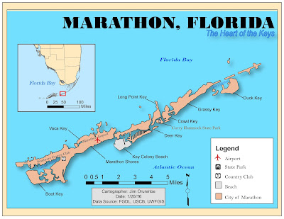
   As stated earlier, I design the map basics and essentials in ArcMap, basics such as the , map title, north arrow, map scale, neatline, background color, insert map, insert map scale, insert map extent, dat source, date, cartographer's name and final the frame of the legend box(without the legend icon/descriptions).

   I then export the map to Ai. In Ai, I "locked" all imported layers and created new layers for the map subtitle, the different feature types, and the leader lines. After labeling all features types that the assignment required, I then proceeded to create the map legend. I used the Ai's stock icons for Airport, State Park, and Country Club, but I created a new icon for the Beach and City legend features using the "rectangle tool" in Ai with corresponding marching area color. 
  
  Finally, I added the required three customization, which includes:
  1. Drop shadow: I decided to visually aid the map’s depth by adding drop shadow.                    
  2. Italicized hydrographic labels: I also decided to italicized all hydrographic labels.   
  3. Contrasting color: Another customized part of this map was one on the Key Colony Beach. I chose to contrast the beach geographical are against the surrounding landmass, in order to highlight that recreational area. I also did some color play with State Park.
  Even though I spent a lot of time trying to decide on colors that will best suit the different features, I really enjoy this lab. It also made evident that I need to work on my Ai skills.

Friday, January 22, 2016

Own Your Map

I Owned My Map!

This Week

This week (week2Lab) I use ArcGIS to create a map that depict the location of the University of West Florida main campus in the Escambia County of the State of Florida. I really enjoy this Lab assignment because it afford me the opportunity to explore more features of the ArcGIS/ArcCatalog software. I explored and had fun going through the Lab instruction and digressed (clicking around) a lot.

Yes! the title reads "Own Your Map" but at the same time, I had my audience in mine. My goal was to follow the Lab instruction, explore possible alternatives, but most importantly I set out to create a map that is clean clear, and informative. I did my best to achieve this. 

University of West Florida (UWF) main campus location is the primary focus of this map, hence the need to depict the location on the map as prominent as possible. 

Addition features such as the Interstates 10 (I-10), Interstate 110 (I-110), the cities of Pensacola and Ferry Pass are notable reference landmarks that will help the end user of the map locate the UWF main campus location.

This map is designed with the end user in mind such that, at a first glance at the map, major features on the map point the user to the primary purpose of the map. The UWF Logo on the top right-hand corner, the header, the legend, and the bright green star - all these features show the purpose of the map.


Map of the University of West Florida Main Campus, Pensacola

An inserted map of the State of Florida with a highlight Escambia county inform the user(s) that UWF is located in the Florida Panhandle.

Making of the Map:
 -Layout: I chose the Landscape layout instead of the Portrait because it afford me the room to have a cleaner layout of the map features(Legend, Header, North Arrow, etc.)  
 -Scale: I chose a scale with even and whole number because it will be easier for most/all user's conversion uses.
 -North Arrow: I chose the trimmed, minimalist version of the north arrow because I want to minimize distraction from the primary map.
 -Color: I chose a bright yellow color for UWF location, because it contrast well against the light green surrounding, and the same reasons applies my my choice of color for the Escambia County map in the insert.
 -Credit: This is located at the very bottom right-hand corner of my map, and it gives credence to my source. Right about the data source is the 'produced by,' which shows that I created this map using the resources provided.

What I learn/enjoy in this Lab:
-I created my first Shapefile.
-I learn how to locate Metadata.
-I learn how to insert a Lagger Map.
-I edited Symbology and use Query Builder.
-I learn alternative ways to edit maps, such as, Right-clicking instead of Double-clicking.
-I learn how to Clip Data Frame, Exclude Layers.
-I learn how to add multiple shapefiles to Data Frame(s) -by using Shift or Ctrl + select on the keyboard.
-I learn to Safe my work in ArcMap frequently, and Effective File Management.
-I also learn how to create Layers from Selected Features and I had a lots of fun working on the Legend Wizard.

I enjoy this Lab and I'm gaining more confidence in GIS, I can't wait to explore all the possibilities.


Wednesday, January 13, 2016

Introduction

Introduction

Hello! My name is Jim Orunmbe, I am an IT major and currently reside in Pensacola Florida. I am also currently in the Army Reserve and a full-time student. I invest my free time with my girlfriend-Tolu, reading, and volunteering. I also enjoy outdoor fun stuff such as soccer, running and mountain biking. I'm in this class in order to earn GIS Certificate and I do not have any prior  GIS experience. As of now, my goal is to use the knowledge gained from this course to enhance my job in the military, maybe something greater in the civilian world later down the road.

Introduction / Overview


Introduction / Overview

Hello! My name is Jim Orunmbe, I am an IT major and currently reside in Pensacola Florida. I am also currently in the Army Reserve and a full-time student. I invest my free time with my girlfriend-Tolu, reading, and volunteering. I also enjoy outdoor fun stuff such as soccer, running and mountain biking. I'm in this class in order to earn GIS Certificate and I do not have any prior  GIS experience. As of now, my goal is to use the knowledge gained from this course to enhance my job in the military, maybe something greater in the civilian world later down the road.

Here's my Story Map Link: http://arcg.is/1mSnBSI

Map Evaluation Synopses of a Well-designed and a Poorly-designed map.

   Sample of a Well-designed Map: The City of Bellevue.


I consider the above map to be a well-designed map.
Map principles in support:
1.     Graphical excellence. This map is well-designed because it has interesting data on the map that are also represented on the Legend in the bottom-left-hand-corner.
2.     Maximize the data-ink ratio. This map maximized the data-to-ink ratio.
3.     Clear, detailed, and thorough labeling is used. I really like the fact that this map has scale on the legend (this will come handy where distance between 2 or more points are needed.) It also has the cardinal representation of the map orientation.


Sample of a Poorly-designed map: US 1999 Capital Population.


I think the above map is poorly designed.
Map principles in support of my conclusion:
1.     Principle 7. This map violates Tufteism 7, it lacks details and clarity evident in the overlapping circles all over the map. It’s hard to interpret or make sense of.
2.     This map violates Principle 8. The legend is poorly designed, take for instance the following city/town: Carson City on the west coast, Cheyenne, and Pelena have one thing in common -  they all no statistical representation in the Legend. It appears to me that the value falls between “.10” and “.66.” Map users should not be left to speculating the value of what the map represents.
3.     Scale: I think this map failed to meet its objective because the circular representation on the map and the legend did not match ( I measured the radii of the circles.) The scale of cycles on legend did not accurately represent cycles on the map.