GIS3015

Thursday, September 14, 2017

Mod6 - Data Classification

Data Classification

   This week the focus is on Classification Methods of data sets when rendered in maps. The completed map below is based on the percentage of the population that's above age 65 by census tract for Miami Dade County, FL.

  This map was created in ArcMap using 2010 census data from the United State Census Bureau and other data and instructions from University of West Florida GIS. 

  The five objective of this module are:
  1. demonstration of four most commonly used data classification methods.
  2. prepare one map with four data frames utilizing ArcMap software.
  3. effectively symbolize the map for easy data acquisition/interpretation.
  4. compare and contrast classification methods.
  5. identify the best suited classification method for spatial data representation.


The classification methods focused on are: Equal Intervals, Natural Breaks, Quantile, and Standard Deviation. I will briefly expatiate on each of the classification methods. 

Equal Interval: The equal interval classification method presents the data by separating it into classes. It divides the total range (Max – Min value) by number of classes to be created. This method is one of the simplest and can be done by hand if necessary. However this method doesn’t take into account how the data falls along a number line and could lead to classes with no values in them. A positive of this method is that there are no gaps in the legend data could lead to confusion.
Natural Break: In this method, data are subjectively broken into classes and as alluded to above, it takes into account where the data is along a number line and tries to group data items based on where they occur most frequently. This tries to keep like values together and unlike values in separate classes.
Quantile : Classifying the data into quantile separates it into numbers of observations per class. This is done through ranking order, e.g. (lowest to highest number) until all data has been equally dispersed among the classes. This does not take into account any data clustering or “Natural Breaks.” Unlike the Equal Interval method there is (are) no chance of an empty class (es) skewing the map.
Standard Deviation : This method of classification does take into account where the numbers lie on a number line. The advantage and disadvantage to this method is that it relies on having normally distributed data. For events with data that follows a Gaussian or standard bell curve this is an excellent choice but, when not dealing with bell curve shaped style of data that contains roughly equal amounts of data points on either side of the mean standard deviation the result will most likely be skewed due to empty classes.
Out of the four classification methods we went over, I prefer Natural Breaks because it best visually represent the statistical data sets. It a fun lab!

Tuesday, September 12, 2017

Mod4 - Cartographic Design

Public Schools in Ward 7, Washington, D.C.

This week's lesson and revolved around cartographic design. The objective was to create a map of the Public Schools in the Ward 7 of Washington D.C. area.
Ward 7 Public Schools of Washington, D.C.


In order to highlight the schools, several important cartographic design principles had to be included based on Gestalt's Principles.


First principle to be considered was Visual Hierarchy which involves adding symbols and map elements to the map ranked according to their importance. An example would be minimizing the minor streets in an area and highlighting major roads for visual reference - using color shade, line width etc.

The second principle required implementing adequate contrast to the map. This ensures visual variance or contrast within the map.

The third principle is Figure Ground which creates an appearance that certain object appears closer to the map user accentuating their importance.

Balance is the forth principle that must be adhere to. This involves creating a map with features that does not compete for spacial and visual real estate but complement each other.

The primary objective of this lab was to highlight the Public Schools in Ward 7 of Washington D.C. The map is rendered in such a manner that the objects - Public Schools in Ward 7 are easily identified as the focus of the map using color of map features, size, background color, and other essential map elements to attain these objectives.

While creating this map the ran into a couple stumbling blocks, chief among the problems was label roads and color choices. I had to edit the attribute table of roads by adding a new column and editing the column to contain abbreviated interstate road name numbers. I spent a copious amount of time trying different colors that will adhere to the fundamental principles of Gestalt's Principles before settling for this final output.

This lab is fun, challenging and I am happy with the amount f time I put into it.

Thursday, May 26, 2016

Natural Hazards: Lahars

This week in GIS Applications, I delved into how GIS can be used to plan for environmental hazards. The primary focus this week was on Lahar. What are Lahars? Lahor are volcanic debris flow consisting of ash, soil, breccia, boulders, water which can be with cold or hot, traveling through natural ravines and river ways.

Mount Hood in Oregon is the study area for this week's lab. With focus on the study area, hydrology analysis was conducted to define/identify:

  • the river ways (flow direction) that will channel the Lahar
  • identify local population that will be impacted by the Lahar
  • identify critical infrastructures in the path of or within the buffer of the Lahar e.g. Schools
Acting as a private consultant hired to identify potential inundation zones within Mount Hood, Oregon proximity, I used the Oregon school data to identify schools at risk of inundation and the 2010 Census data to conduct population analysis. I created a map that can be used by local and state officials for hazard planning and response, using ArcMap hydrology tool to determine the Lahar flow path via a mosaicked digital elevation model (DEM).


Mt. Hood Lahar Hazard Assessment


Python Fundamentals Part 1

This week I delve into the fundamentals of Python and how it applies to GIS in ArcMap. This week's exercises and lab covered basic Python Script execution which serves as the foundation for the things to come in this class. I learn how to create a String of my full name and then split it (the name) into a list (first name and last name), before printing out the last name. I also executed a script that calculated the numbers of alphabets in my last and then multiply the number generated by 3.

The primary objective of this lab are:

  1. Assign string variables
  2. Use methods and functions to manipulate lists and strings
  3. Perform basic math functions
  4. Learn how to use the ArcGIS Python "help" function to write codes
  5. Learn the basics of conditional statements
The image below shows Python's Interactive Window the script that prints my last name and the length of the last name multiplied by 3.


Last Name Multiplied by 3
The exercise past of this module was fun and aided assimilation of the module content.

Monday, May 16, 2016

Introduction to Python

Week 1 lab of this class is an Introduction to programming in Python with focus on:

  • recognizing basic features of Python
  • compare scripting vs programming (Scripts-interprete; Programing-compile)
  • review the history of Python and scripting in ArcGIS
  • exploring using Python with three different interfaces, and,
  • learning about pseudocode and how it is used in programming.
I also learn about different Python interfaces and created new folders and sub folders using Python Script (image below)

12 Folders and Sub-Folders created by Python Script
I also installed PythonWin and did the class exercise where I print(displayed) "Hello World." The image above is an example of the versatility of Python script in efficient folder and subfolder creation.

Here's a sample an executed script that print "Hello World" in the Python IDLE (top part of image) and the PythonWin Interactive Window (bottom part of image):

PythonWin and IDLE Interfaces

Thursday, May 12, 2016

Own Your Map

This week I use ArcGIS to create a map that shows the main campus of University of West Florida, in Escambia County, Florida.

Other important/identifiable relational features such as the Interstate 10 (I-10) , I-110, and the cities of Pensacola and Ferry Pass were added to the map.

The final map (picture below) shows UWF main campus represented with the red star. An insert map of the State of Florida was added to the map showing the location of the Escambia County in the State of Florida.

UWF logo was added to map the highlight the primary objective of the map, and the map legend is provided to help identify map features.


UWF Main Campus

Sunday, May 1, 2016

Final Project

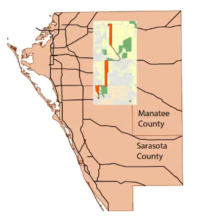
The final project for GIS4043/L was based on a historic look at Florida Power & Transmission Line project sited between Sarasota and Manatee, counties. The preferred corridor selection included multiple criteria but this class project focused on the following four primary objectives:

  • What impact will the proposed project have conservation areas?
  • Minimized the number of homes impacted by the corridor.
  • Avoid close proximity to Schools and Daycares.
  • Avoid routes high cost.
The project also required a PowerPoint presentation accompanied with Commentary. Links to both documents are provided below.

Links:
        http://students.uwf.edu/joo3/Orunmbe's_Presentation.pptx
        http://students.uwf.edu/joo3/Orunmbe's_Commentary.docx
       
Scroll down to view some of the maps created during the Bobwhite-Manatee Transmission Line project ->

Overview Location of the Study Area, and Preferred Corridor in Manatee and Sarasota Counties. 
Map show the End-to-end straight line distance and Center point distance.
Map showing Conservation Areas.
Map shows home that are directly within the buffer.
Map shows Preferred Corridor proximity to Schools.