GIS3015

Thursday, September 21, 2017

Mod11 - 3D Mapping

3D Mapping

I started this week's work from the assigned ESRI Training Module on 3D Visualization Techniques Using ArcGIS software. The training was done on ESRI web portal. This training module introduced new terms in addition to new techniques such as:
  • Triangulated Irregular Networks (TINs), 
  • Terrain Datasets, and 
  • Multipatches. 
The primary focus was working with 3D features, discrete geographic features such as buildings, rivers, and wells that can be found on or beneath a visible surface. 
I also used ArcScene to display 2D features in a 3D rendering. In the first portion of the training learn how to navigate ArcScene, view 3D data and how to use the Attribute Table's Shape field to determine if the data is a 3D feature class. I then proceed to learned how to set Base Heights for raster data which are set to 0 by default and 3D views enhancement techniques. 

Fig 1. Vertical Exaggeration of 3D layers
In Fig.1, the visual effect of raster elevation data for the Twin Cities of Minnesota was changed by exaggerating the differences in elevation values. the measures values are not altered by executing the  exaggeration technique but the appearance changes. Negative exaggeration has the effect of inverting the data's appearance. Changes in illumination values and background colors  alters the appearance of data. Also changes to the appearance of sunlight's angle/altitude, emphasizes or reduces variations seen on the surface of the 3D rendition. It is also worthy of mention that background colors can make a 3D layer appear to float or provide geographic reference (sky, horizon, water body); a pop effect visually.

Fig.2. Extrusion of Buildings and Wells
In Fig 2., above, I executed extrusion technique to extend features (building and wells) that are above and below the surface. Buildings were extruded above the surface using their Height value while Wells were extruded below the surface using their Depth value. The wells features appeared as flat points on the surface so an offset value was applied to raise them slightly above the surrounding surface. The aerial photo/picture layer in this Fig.2 was draped over the underlying elevation TIN layer, by setting the photo's base height to the elevation values of the TIN.

Fig.3. Extrusion of Land Parcel (showing cost/value of the buildings)
In Fig.3, shows that the z-values does not have to always represent height. The example above shows building parcels in Manhattan, KS that were extruded based on their property value(cost) attribute. Properties with a higher total value were extruded more than lower valued properties. The z-values are not always proportional to their x,y values. Vertical exaggeration was also applied to the features in order for the features to appear proportionally. This was the last training exercise done in ESRI training course for this module.

Fig.4. Extruded Building in Boston viewed via Google Earth
The last phase of this lab exercise was done in ArcMap and Google Earth. Using 3D Analyst tool (Create Random Points) I created Sample Points for 343 buildings in Boston and with these points I performed calculations to determined the mean height for each building which are represented by the z-values. The z-values were used to extrude the buildings in Boston. I then proceed to exported the extruded buildings data in order to create a layer and then converted that layer to a KML file. Finally, the create/exported KML file was opened in Google Earth as seen  in Fig. 4 above.

The extruding buildings such as in the Boston buildings in Fig.4 enables viewers to visually focus on a specific area and view the buildings from different perspectives - above, street level, from different directions - building heights can be compared with relative ease.

Here are other map features created during the course of this lab for your view pleasure.

Fig.5. Elevation Layer draped with Raster (done in ArcScene)

Fig.6. 3D Layer Classified (done in ArcGlobe) 

In conclusion I think it is worthy of note to mention that 3D mapping applications can be used for areal simulation, urban planning, transportation network, real estate, and census to mention just a few. This a fun lab and the result both satisfying and rewarding (visually).

Mod12 - NeoCartography / Google Earth

NeoCartography / Google Earth

This week's focus is on NeoCartography / Google Earth but before I proceed into my gist about this adventure, let me define a couple new terms.
  1. NeoCartography (literally "new cartography"): is the new way of both representing and communication geographical information. It is informal and lacks thorough academic data analysis.
  2. Volunteered Geographical Information (VGI): is the use of various tools to create, assemble, and disseminate geographic data provided voluntarily by individuals. It is basically a set of user-generated contents.
  3. Public Participation Geographic Information System (PPGIS): the inclusion of marginalized population in mapping and GIS academic practices through geographic technology education and participation.
  4. Other key terms are Geolocation, Geotagging, Cloud Computing and Cloud-based GIS, I believe these terms are self-explanatory.
Now that I have the definition of the key term learned this week out of the way, the primary objective of this lab is to learn how to navigate/use Google Earth using the South Florida Population Density information from Module 10 as our case study.

To achieve the module's objective, I started my work from ArcGIS where I edited the legend features of "Population  Density Dots" from customed to standard ArcMap depiction of the map features. I then proceed to export two .kmz files ( a zipped version of .kml files) and open it in Google Earth.
Below is a screenshot of South Florida Dot Density map overlayed on a map of Florida from Google Earth.

In Google Earth, I created a fun tour of key locations in South Florida to include but not limited to Miami, Tampa, etc. The tour is not shared in this blog.

 The map above shows downtown Tampa Florida.

This, on the other hand, shows downtown of the city of Miami.

This is one of the most interesting modules. I enjoyed every step along the way and look forward to playing with layers of map features to depict real-life data or phenomena.

Thursday, September 14, 2017

Mod2 - Introduction to Graphic Design with Adobe Illustrator

Intro to Graphic Design with Adobe Illustrator

Weeks 2 ushered us into the realm Adobe Illustrator.The objective was to create a basic map using ArcMap featuring Florida Counties, major cites, and bodies of water. After the map was created in ArcMap and exported from ArcMap to Adobe Illustrator with the objective of enhancing the map with Florida State symbols (Seal, State Animals, and Flag).

I explored AI's tools such as the text tool which allows the user to manipulate the text in a variety of ways, color swatches, and shape tools. I also explore importing scripts and creating shapes as well.

The map above depict my lack of proficiency with the software as of a year ago.

Mod7 - Choropleth

Choropleth and Proportional Symbol Mapping

Hi, this week I learned how to create a Choropleth map. My most important take away from this week's lab is the of understanding the data I am trying to present, hence, the need to always review and understand the attribute tables' contents and how they relate to each other.

The first part of the lab involves having an in depth look at the attribute table, which contains the provided data sets for the continent of Europe. Population density and wine consumption are the two primary focus. 

After reviewing the attribute tables' contents, I proceeded to choose how to display the differences in population density across the continent. I chose to use a multi-hued sequential color scheme on Color Brewer and copied the RGB values to create a color ramp. Secondly, I classify the data, opting for the Quantile classification method. The quantile classification method best visually represent the population density of the continent. The Quantile scheme allowed all classes to be visibly represented on the map without any monotone colors confusing viewers/map users as to which class a country belong to. I also group the population density data into five class.


Furthermore, I assessed the wine consumption data for how to best display the data sets. Armed with the fact that: "Proportional and Graduated Symbol mapping are methods of mapping that use visual variables of different size to represent differences in the phenomena, and knowing that Graduated Symbols are best used for data that is classed and Proportional Symbols are best used for unclassified data." I used Graduated Symbols to represent the wine consumption throughout Europe, because Graduated Symbols work best with classed data as opposed to Proportional symbols which work best for raw and unclassified data.

On the color choices, I chose a color scheme that ranges from light yellow/orange to dark red/orange such that my data are represented in sequential order, such as the increase in population density. The lighter colors represented lower data values such as lower population density and the darker colors represented high data values such as higher population densities.

The most challenging part of creating this map was using Adobe Illustrator to create the five different bottles that symbolizes the rate of wine consumption. I found out very quickly that my Illustrator skills became rusty after months of not using the application.

Lastly and most importantly, I learned to always review the content of the attribute table. 

Mod10 - Dot Mapping

Dot Mapping

This week's lab covers the final lesson in thematic mapping. Dot mapping indicates the location of one or more occurrences of a geographic phenomenon using dot symbols. This method of thematic mapping can also be called dot density maps or areal frequency maps. The main characteristics of a dot map is the use of small dots symbolize spatial distributions. The number of dots directly related to the number of objects being mapped.
Conceptual or raw data may be used in creating Dot maps. Dot maps are not used for mapping continuous data but are applicable for:
  • discrete data occurring at points, 
  • when comparing the distributions of related phenomenon, and 
  • when portraying variations or patterns in density.

Dot maps are easy to understand and are effective for showing phenomena that exist in large quantities. Several disadvantages are that they are hard to estimate density and map readers could interpret dots to represent a single occurrence. Dot maps are most commonly used for agricultural maps.

Dot maps can be represented as one-to-one, which is better for smaller geographical areas or one-to-many, which is best for larger geographical areas. 

In creating a dot map, major factors to consider are:
  •  the scale of enumeration units, 
  • dot value and, 
  • dot size. 
Fun map to make but it crashed multiple times and I have forgot to add an insert map the state of Florida that I intended to add.

Mod8 - Isarithmic Mapping

Isarithmic Mapping

In this week's lab I learn about Isarithmic maps which are used to depict smooth, continuous phenomena across an area using different symbology. I also learned about the two different types of data that are best suited for this type of mapping, True Point data and Conceptual Point data. This lab also covered four different methods of data interpolation that are used to derive intermediate points to create the data set, these are: Inverse Distance Weight (IDW), Kriging, Splining, and Triangulation.

This lab assignment was based of the school provided data of precipitation over a 30 year cycle for Washington and the map was designed entirely in ArcMap.
The precipitation data for the State of Washington that was derived and interpolated using PRISM (Parameter-elevation Relationships on Independent Slopes Model) analytical model. This model uses point data and an underlying grid such as a Digital Elevation Model (DEM) to generate grid estimates of monthly or annual precipitation. The precipitation data set was created from the application of this method on point data collected from weather monitoring stations and the calculated climate elevation regression for each grid cell within the DEM. The created data set accounts for physio-graphic factors that may influence climate patterns.

The primary objective of this lab are:
  • Define an Isarithmic Map, review different kinds of isarithmic maps
  • Identify appropriate data types for Isarithmic mapping
  • Recall different interpolation methods (Triangulation, kriging, Inverse Distance Weighted, PRISM)
  • Recognize the different symbolization methods
  • Implement continuous tone symbology
  • Implement hypsometric symbology
  • Describe the basics of and create contour lines
  • Work with continuous raster data, and
  • Employ hill-shade relief
Here's the map rendered:
Hypsometric May with Contour Lines
   The map above used Hypsometric Tint symbology to represent the data with manual classifications f the annual precipitation into 10 classes. A "stepped" or 3-D like surface is created to more easily visually interpret the precipitation differences across the State, with lower values represented by bright/light colors while darker colors represent higher values. 
  This is a fun and color lab.

Mod6 - Data Classification

Data Classification

   This week the focus is on Classification Methods of data sets when rendered in maps. The completed map below is based on the percentage of the population that's above age 65 by census tract for Miami Dade County, FL.

  This map was created in ArcMap using 2010 census data from the United State Census Bureau and other data and instructions from University of West Florida GIS. 

  The five objective of this module are:
  1. demonstration of four most commonly used data classification methods.
  2. prepare one map with four data frames utilizing ArcMap software.
  3. effectively symbolize the map for easy data acquisition/interpretation.
  4. compare and contrast classification methods.
  5. identify the best suited classification method for spatial data representation.


The classification methods focused on are: Equal Intervals, Natural Breaks, Quantile, and Standard Deviation. I will briefly expatiate on each of the classification methods. 

Equal Interval: The equal interval classification method presents the data by separating it into classes. It divides the total range (Max – Min value) by number of classes to be created. This method is one of the simplest and can be done by hand if necessary. However this method doesn’t take into account how the data falls along a number line and could lead to classes with no values in them. A positive of this method is that there are no gaps in the legend data could lead to confusion.
Natural Break: In this method, data are subjectively broken into classes and as alluded to above, it takes into account where the data is along a number line and tries to group data items based on where they occur most frequently. This tries to keep like values together and unlike values in separate classes.
Quantile : Classifying the data into quantile separates it into numbers of observations per class. This is done through ranking order, e.g. (lowest to highest number) until all data has been equally dispersed among the classes. This does not take into account any data clustering or “Natural Breaks.” Unlike the Equal Interval method there is (are) no chance of an empty class (es) skewing the map.
Standard Deviation : This method of classification does take into account where the numbers lie on a number line. The advantage and disadvantage to this method is that it relies on having normally distributed data. For events with data that follows a Gaussian or standard bell curve this is an excellent choice but, when not dealing with bell curve shaped style of data that contains roughly equal amounts of data points on either side of the mean standard deviation the result will most likely be skewed due to empty classes.
Out of the four classification methods we went over, I prefer Natural Breaks because it best visually represent the statistical data sets. It a fun lab!

Tuesday, September 12, 2017

Mod4 - Cartographic Design

Public Schools in Ward 7, Washington, D.C.

This week's lesson and revolved around cartographic design. The objective was to create a map of the Public Schools in the Ward 7 of Washington D.C. area.
Ward 7 Public Schools of Washington, D.C.


In order to highlight the schools, several important cartographic design principles had to be included based on Gestalt's Principles.


First principle to be considered was Visual Hierarchy which involves adding symbols and map elements to the map ranked according to their importance. An example would be minimizing the minor streets in an area and highlighting major roads for visual reference - using color shade, line width etc.

The second principle required implementing adequate contrast to the map. This ensures visual variance or contrast within the map.

The third principle is Figure Ground which creates an appearance that certain object appears closer to the map user accentuating their importance.

Balance is the forth principle that must be adhere to. This involves creating a map with features that does not compete for spacial and visual real estate but complement each other.

The primary objective of this lab was to highlight the Public Schools in Ward 7 of Washington D.C. The map is rendered in such a manner that the objects - Public Schools in Ward 7 are easily identified as the focus of the map using color of map features, size, background color, and other essential map elements to attain these objectives.

While creating this map the ran into a couple stumbling blocks, chief among the problems was label roads and color choices. I had to edit the attribute table of roads by adding a new column and editing the column to contain abbreviated interstate road name numbers. I spent a copious amount of time trying different colors that will adhere to the fundamental principles of Gestalt's Principles before settling for this final output.

This lab is fun, challenging and I am happy with the amount f time I put into it.

Thursday, May 26, 2016

Natural Hazards: Lahars

This week in GIS Applications, I delved into how GIS can be used to plan for environmental hazards. The primary focus this week was on Lahar. What are Lahars? Lahor are volcanic debris flow consisting of ash, soil, breccia, boulders, water which can be with cold or hot, traveling through natural ravines and river ways.

Mount Hood in Oregon is the study area for this week's lab. With focus on the study area, hydrology analysis was conducted to define/identify:

  • the river ways (flow direction) that will channel the Lahar
  • identify local population that will be impacted by the Lahar
  • identify critical infrastructures in the path of or within the buffer of the Lahar e.g. Schools
Acting as a private consultant hired to identify potential inundation zones within Mount Hood, Oregon proximity, I used the Oregon school data to identify schools at risk of inundation and the 2010 Census data to conduct population analysis. I created a map that can be used by local and state officials for hazard planning and response, using ArcMap hydrology tool to determine the Lahar flow path via a mosaicked digital elevation model (DEM).


Mt. Hood Lahar Hazard Assessment


Python Fundamentals Part 1

This week I delve into the fundamentals of Python and how it applies to GIS in ArcMap. This week's exercises and lab covered basic Python Script execution which serves as the foundation for the things to come in this class. I learn how to create a String of my full name and then split it (the name) into a list (first name and last name), before printing out the last name. I also executed a script that calculated the numbers of alphabets in my last and then multiply the number generated by 3.

The primary objective of this lab are:

  1. Assign string variables
  2. Use methods and functions to manipulate lists and strings
  3. Perform basic math functions
  4. Learn how to use the ArcGIS Python "help" function to write codes
  5. Learn the basics of conditional statements
The image below shows Python's Interactive Window the script that prints my last name and the length of the last name multiplied by 3.


Last Name Multiplied by 3
The exercise past of this module was fun and aided assimilation of the module content.

Monday, May 16, 2016

Introduction to Python

Week 1 lab of this class is an Introduction to programming in Python with focus on:

  • recognizing basic features of Python
  • compare scripting vs programming (Scripts-interprete; Programing-compile)
  • review the history of Python and scripting in ArcGIS
  • exploring using Python with three different interfaces, and,
  • learning about pseudocode and how it is used in programming.
I also learn about different Python interfaces and created new folders and sub folders using Python Script (image below)

12 Folders and Sub-Folders created by Python Script
I also installed PythonWin and did the class exercise where I print(displayed) "Hello World." The image above is an example of the versatility of Python script in efficient folder and subfolder creation.

Here's a sample an executed script that print "Hello World" in the Python IDLE (top part of image) and the PythonWin Interactive Window (bottom part of image):

PythonWin and IDLE Interfaces

Thursday, May 12, 2016

Own Your Map

This week I use ArcGIS to create a map that shows the main campus of University of West Florida, in Escambia County, Florida.

Other important/identifiable relational features such as the Interstate 10 (I-10) , I-110, and the cities of Pensacola and Ferry Pass were added to the map.

The final map (picture below) shows UWF main campus represented with the red star. An insert map of the State of Florida was added to the map showing the location of the Escambia County in the State of Florida.

UWF logo was added to map the highlight the primary objective of the map, and the map legend is provided to help identify map features.


UWF Main Campus

Sunday, May 1, 2016

Final Project

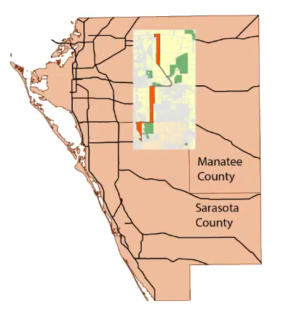
The final project for GIS4043/L was based on a historic look at Florida Power & Transmission Line project sited between Sarasota and Manatee, counties. The preferred corridor selection included multiple criteria but this class project focused on the following four primary objectives:

  • What impact will the proposed project have conservation areas?
  • Minimized the number of homes impacted by the corridor.
  • Avoid close proximity to Schools and Daycares.
  • Avoid routes high cost.
The project also required a PowerPoint presentation accompanied with Commentary. Links to both documents are provided below.

Links:
        http://students.uwf.edu/joo3/Orunmbe's_Presentation.pptx
        http://students.uwf.edu/joo3/Orunmbe's_Commentary.docx
       
Scroll down to view some of the maps created during the Bobwhite-Manatee Transmission Line project ->

Overview Location of the Study Area, and Preferred Corridor in Manatee and Sarasota Counties. 
Map show the End-to-end straight line distance and Center point distance.
Map showing Conservation Areas.
Map shows home that are directly within the buffer.
Map shows Preferred Corridor proximity to Schools. 

Thursday, April 28, 2016

Final Project


For the Cartographic Skills final project I assumed the scenario of being a cartographer at the National Center for Education Statistics. The assignment was to create a single map showing the 2014 average ACT scores and percent of graduates tested in the continental United States for intended submission to the Washington Post newspaper. We were to consider all the elements we have learned in this class to create an accurate and attractive map. 


I begin the map project by reading the Washington Post article and then researched the final audience of the map. I examined different types of thematic map methods that will best portray the data. I chose choropleth and projected my basemaps to North American Albers Equal Area Conic which maintains area proportional to the ground - important for data aggregated from an entire state. I used choropleth mapping to show the distribution of SAT scores across the country and their relationship to their enumeration unit (State). I then used proportional symbols for the percent of graduates tested data to show the proportion of the value within each state. I chose Natural Breaks(Jenks) classification used 6 class scheme, expanding the class from 5 to 6 in order to capture any low-value outliers. This classification scheme highlighted a wider range of values than just 5 classes and stayed clear of potential hue differentiation problems that can occur with 7 or more classes. The range of colors is easily read and my proportional symbols are not so small they are hard to see or so large they create significant overlap. I added an inset for Hawaii (HI) and Alaska (AK) to capture the geographically distant States and for clarity. 

My design choices centered around my previous projects on choropleth maps; I primarily used low intensity and non-garish colors, and had limited embellishments. I organized my data frames to keep HI and AK clearly visible but they are not in a location relatively to their true geographic locations, I avoid glow and drop shadow with the goal of keeping the map simple, and chose complementary colors for a balanced, attractive map. 

Wednesday, March 23, 2016

Vector Analysis 2

This week is the second phase of vector analysis; the first part of this analysis does not require a blog post. I learned how to use two of the most common modeling tools in ArcGIS - Buffer and Overlay. I also created three buffer zones using ArcPy scripts. The primary deliverable for the vector analysis is a map showing the possible campsite locations, roads, lakes and rivers in De Soto National Forest in Mississippi. Using Buffer & Overlay I displayed the locations that were within 500 meters of a river, 150 meters of a lake, and 300 meters of a roads. Conservation areas were excluded from the site selection.

What is the Overlay tool-set? This is a set of tools that allow an analyst to combine, erase, modify or update the feature and information from multiple thematic layers to create a new layer for continued analyses. I also used the Union tool to combine two different layers, the Intersection tool to identify areas common to two layers rather than combining them, and an Erase tool to remove unwanted areas from a layer.

What is the Buffer tool? This tool is used to create a buffer area around an object (a point, line, or polygon).Specific distance (buffer distances) around an object (a point, line, or polygon) can be set for analyses purposes. In the De Soto National Forest below, I apply buffers to the roads and water objects in order to deduce the areas common to both elements.


The map above shows the possible campsites in the De Soto National Forest in Mississippi.

Sunday, March 13, 2016

Mod9 - Flow Line Mapping

Flow Line Map of Immigrants to the United States in 2007.

I used the accurate placement method to create this Flow Line map. Accurate placement methods is style of creating flow line map that involves the placement of arrow headed lines that depict the direction of flow of people, ideas and commodities.

This map shows a Distributive  flow map of Immigrants to United States of America from all the regions in the year 2007.

To create this map, I used the imported base map from ESRI and an Excel spreadsheet of immigrants statistical data from the U.S. Department of Homeland Security's Office of Immigrant Statistics. 
I import the ESRI base map into Adobe Illustrator and created additional Layers from Flow Lines, Map Title, Legend, Region Names, and After Effects.

I then design the map to the standard specified in the lab instruction using tools available in AI. After creating the flow lines pointing towards the U.S. choropleth map, I then open the Excel document containing the Immigrants' statistical data, calculate the square root of the 2007 immigrants in each region in one column, and the width of line symbol in another column.

I then proceed to use the result of the calculations to re-size thickness of the flow line such that the flow lines are proportional to the amount of people from each region. I finalize the map by adding the Drop Shadow and Inner Glow effects to the map heading and flow lines respectively.

I really enjoy making this making this map and feel fulfilled using AI successfully after many years of avoiding it.

Friday, March 4, 2016

Data Search Lab 7 & 8

Week 7&8 Lab was a fun and challenging data search and download project. The primary objective of this lab is for students to learn where to access and download data (free data sources), project the layers, and how to clip both Vector and Raster data. The following maps vector, raster and environmental datasets.

My major takeaway from this lab is what ArcTool clipping tool to use for Raster and Vector datasets. I clipped the Vector datasets using Clip(Analysis) tool and Clip(Data Management) the Raster datasets.

The lab required students to download nine data layers sets for the creation of 1-3maps for individually assigned County in Florida. I was assigned Okechobee County.

After downloading all the required datasets, I then proceeded to clip all layers to the Okeechobee County. I obtained the aerial imagery from LABINS.org and other map data came from past class labs and FGDL.gov.

Map 1 shows the elevation model (DEM) of the entire Okechobee county.
I am surprised at the number of invasive species at the "mouth" of Lake Okeechobee on the lower half of the map on the right. Studies conducted by the US Army Corps of Engineers revealed that "there are approximately 50,000 non-native species and approximately4,300 are considered invasive." Source: http://www.saj.usace.army.mil/Missions/Environmental/InvasiveSpecies.aspx

Map 2 comprises of two maps in one. Invasive Species in Okeechobee Co. and the county's hydrology