GIS3015

Thursday, May 26, 2016

Natural Hazards: Lahars

This week in GIS Applications, I delved into how GIS can be used to plan for environmental hazards. The primary focus this week was on Lahar. What are Lahars? Lahor are volcanic debris flow consisting of ash, soil, breccia, boulders, water which can be with cold or hot, traveling through natural ravines and river ways.

Mount Hood in Oregon is the study area for this week's lab. With focus on the study area, hydrology analysis was conducted to define/identify:

  • the river ways (flow direction) that will channel the Lahar
  • identify local population that will be impacted by the Lahar
  • identify critical infrastructures in the path of or within the buffer of the Lahar e.g. Schools
Acting as a private consultant hired to identify potential inundation zones within Mount Hood, Oregon proximity, I used the Oregon school data to identify schools at risk of inundation and the 2010 Census data to conduct population analysis. I created a map that can be used by local and state officials for hazard planning and response, using ArcMap hydrology tool to determine the Lahar flow path via a mosaicked digital elevation model (DEM).


Mt. Hood Lahar Hazard Assessment


Python Fundamentals Part 1

This week I delve into the fundamentals of Python and how it applies to GIS in ArcMap. This week's exercises and lab covered basic Python Script execution which serves as the foundation for the things to come in this class. I learn how to create a String of my full name and then split it (the name) into a list (first name and last name), before printing out the last name. I also executed a script that calculated the numbers of alphabets in my last and then multiply the number generated by 3.

The primary objective of this lab are:

  1. Assign string variables
  2. Use methods and functions to manipulate lists and strings
  3. Perform basic math functions
  4. Learn how to use the ArcGIS Python "help" function to write codes
  5. Learn the basics of conditional statements
The image below shows Python's Interactive Window the script that prints my last name and the length of the last name multiplied by 3.


Last Name Multiplied by 3
The exercise past of this module was fun and aided assimilation of the module content.

Monday, May 16, 2016

Introduction to Python

Week 1 lab of this class is an Introduction to programming in Python with focus on:

  • recognizing basic features of Python
  • compare scripting vs programming (Scripts-interprete; Programing-compile)
  • review the history of Python and scripting in ArcGIS
  • exploring using Python with three different interfaces, and,
  • learning about pseudocode and how it is used in programming.
I also learn about different Python interfaces and created new folders and sub folders using Python Script (image below)

12 Folders and Sub-Folders created by Python Script
I also installed PythonWin and did the class exercise where I print(displayed) "Hello World." The image above is an example of the versatility of Python script in efficient folder and subfolder creation.

Here's a sample an executed script that print "Hello World" in the Python IDLE (top part of image) and the PythonWin Interactive Window (bottom part of image):

PythonWin and IDLE Interfaces

Thursday, May 12, 2016

Own Your Map

This week I use ArcGIS to create a map that shows the main campus of University of West Florida, in Escambia County, Florida.

Other important/identifiable relational features such as the Interstate 10 (I-10) , I-110, and the cities of Pensacola and Ferry Pass were added to the map.

The final map (picture below) shows UWF main campus represented with the red star. An insert map of the State of Florida was added to the map showing the location of the Escambia County in the State of Florida.

UWF logo was added to map the highlight the primary objective of the map, and the map legend is provided to help identify map features.


UWF Main Campus

Sunday, May 1, 2016

Final Project

The final project for GIS4043/L was based on a historic look at Florida Power & Transmission Line project sited between Sarasota and Manatee, counties. The preferred corridor selection included multiple criteria but this class project focused on the following four primary objectives:

  • What impact will the proposed project have conservation areas?
  • Minimized the number of homes impacted by the corridor.
  • Avoid close proximity to Schools and Daycares.
  • Avoid routes high cost.
The project also required a PowerPoint presentation accompanied with Commentary. Links to both documents are provided below.

Links:
        http://students.uwf.edu/joo3/Orunmbe's_Presentation.pptx
        http://students.uwf.edu/joo3/Orunmbe's_Commentary.docx
       
Scroll down to view some of the maps created during the Bobwhite-Manatee Transmission Line project ->

Overview Location of the Study Area, and Preferred Corridor in Manatee and Sarasota Counties. 
Map show the End-to-end straight line distance and Center point distance.
Map showing Conservation Areas.
Map shows home that are directly within the buffer.
Map shows Preferred Corridor proximity to Schools. 

Thursday, April 28, 2016

Final Project


For the Cartographic Skills final project I assumed the scenario of being a cartographer at the National Center for Education Statistics. The assignment was to create a single map showing the 2014 average ACT scores and percent of graduates tested in the continental United States for intended submission to the Washington Post newspaper. We were to consider all the elements we have learned in this class to create an accurate and attractive map. 


I begin the map project by reading the Washington Post article and then researched the final audience of the map. I examined different types of thematic map methods that will best portray the data. I chose choropleth and projected my basemaps to North American Albers Equal Area Conic which maintains area proportional to the ground - important for data aggregated from an entire state. I used choropleth mapping to show the distribution of SAT scores across the country and their relationship to their enumeration unit (State). I then used proportional symbols for the percent of graduates tested data to show the proportion of the value within each state. I chose Natural Breaks(Jenks) classification used 6 class scheme, expanding the class from 5 to 6 in order to capture any low-value outliers. This classification scheme highlighted a wider range of values than just 5 classes and stayed clear of potential hue differentiation problems that can occur with 7 or more classes. The range of colors is easily read and my proportional symbols are not so small they are hard to see or so large they create significant overlap. I added an inset for Hawaii (HI) and Alaska (AK) to capture the geographically distant States and for clarity. 

My design choices centered around my previous projects on choropleth maps; I primarily used low intensity and non-garish colors, and had limited embellishments. I organized my data frames to keep HI and AK clearly visible but they are not in a location relatively to their true geographic locations, I avoid glow and drop shadow with the goal of keeping the map simple, and chose complementary colors for a balanced, attractive map. 

Wednesday, March 23, 2016

Vector Analysis 2

This week is the second phase of vector analysis; the first part of this analysis does not require a blog post. I learned how to use two of the most common modeling tools in ArcGIS - Buffer and Overlay. I also created three buffer zones using ArcPy scripts. The primary deliverable for the vector analysis is a map showing the possible campsite locations, roads, lakes and rivers in De Soto National Forest in Mississippi. Using Buffer & Overlay I displayed the locations that were within 500 meters of a river, 150 meters of a lake, and 300 meters of a roads. Conservation areas were excluded from the site selection.

What is the Overlay tool-set? This is a set of tools that allow an analyst to combine, erase, modify or update the feature and information from multiple thematic layers to create a new layer for continued analyses. I also used the Union tool to combine two different layers, the Intersection tool to identify areas common to two layers rather than combining them, and an Erase tool to remove unwanted areas from a layer.

What is the Buffer tool? This tool is used to create a buffer area around an object (a point, line, or polygon).Specific distance (buffer distances) around an object (a point, line, or polygon) can be set for analyses purposes. In the De Soto National Forest below, I apply buffers to the roads and water objects in order to deduce the areas common to both elements.


The map above shows the possible campsites in the De Soto National Forest in Mississippi.

Sunday, March 13, 2016

Mod9 - Flow Line Mapping

Flow Line Map of Immigrants to the United States in 2007.

I used the accurate placement method to create this Flow Line map. Accurate placement methods is style of creating flow line map that involves the placement of arrow headed lines that depict the direction of flow of people, ideas and commodities.

This map shows a Distributive  flow map of Immigrants to United States of America from all the regions in the year 2007.

To create this map, I used the imported base map from ESRI and an Excel spreadsheet of immigrants statistical data from the U.S. Department of Homeland Security's Office of Immigrant Statistics. 
I import the ESRI base map into Adobe Illustrator and created additional Layers from Flow Lines, Map Title, Legend, Region Names, and After Effects.

I then design the map to the standard specified in the lab instruction using tools available in AI. After creating the flow lines pointing towards the U.S. choropleth map, I then open the Excel document containing the Immigrants' statistical data, calculate the square root of the 2007 immigrants in each region in one column, and the width of line symbol in another column.

I then proceed to use the result of the calculations to re-size thickness of the flow line such that the flow lines are proportional to the amount of people from each region. I finalize the map by adding the Drop Shadow and Inner Glow effects to the map heading and flow lines respectively.

I really enjoy making this making this map and feel fulfilled using AI successfully after many years of avoiding it.

Friday, March 4, 2016

Data Search Lab 7 & 8

Week 7&8 Lab was a fun and challenging data search and download project. The primary objective of this lab is for students to learn where to access and download data (free data sources), project the layers, and how to clip both Vector and Raster data. The following maps vector, raster and environmental datasets.

My major takeaway from this lab is what ArcTool clipping tool to use for Raster and Vector datasets. I clipped the Vector datasets using Clip(Analysis) tool and Clip(Data Management) the Raster datasets.

The lab required students to download nine data layers sets for the creation of 1-3maps for individually assigned County in Florida. I was assigned Okechobee County.

After downloading all the required datasets, I then proceeded to clip all layers to the Okeechobee County. I obtained the aerial imagery from LABINS.org and other map data came from past class labs and FGDL.gov.

Map 1 shows the elevation model (DEM) of the entire Okechobee county.
I am surprised at the number of invasive species at the "mouth" of Lake Okeechobee on the lower half of the map on the right. Studies conducted by the US Army Corps of Engineers revealed that "there are approximately 50,000 non-native species and approximately4,300 are considered invasive." Sourcehttp://www.saj.usace.army.mil/Missions/Environmental/InvasiveSpecies.aspx

Map 2 comprises of two maps in one. Invasive Species in Okeechobee Co. and the county's hydrology
                         

Friday, February 19, 2016

Projection Part 2


Week 6 of Intro2GIS Lab focused on how to download datasets, project and define the downloaded datasets in order to obtain a uniform layer definition and projection. I also learn how to manipulate Tabular XY data in Excel format and incorporate the XY data into my map via AcrMap in order to create shapefile.

I acquire the necessary datasets from the following sources:
               1. www.LABINS.org
               2. Florida Geographical Data Library web portal, and
               3. Florida Department of Environmental Protection (the XY data)

This Lab further strengthened my knowledge of how to download data; where to fine the right data; how to project or re-project where the need arises, and how to define and redefine.

I had trouble differentiating Projecting from Defining but after careful repeated practice, I grasp the difference between both and the purposes of it.

I carefully examined the provided examples in Part 1 and Part 2 of the lab and then proceeded to to Part 3 where I downloaded the data needed for the county. I then proceeded to project all layers to a uniform Coordinate System(NAD83 State Plane FIPS 903 Feet). I verified the coordinate system to ensure that the reprojection was executed as expected by the system.

The final map created contained the following:

  • Basemap
  • STCM sites
  • Major Roads
  • County Boundary
  • Aerial Imagery (for Quad5659 Century, FL. (DOQQ: q5659ne, q5659nw, q5659se, q5659nw)) 
  • MRG5659


Multi-Layered map in ArcGIS
Defining
Projecting
STCM (Tabular XY Data)

Monday, February 15, 2016

Mod5 - Spatial Statistics

Spatial Statistics

This week lab assignment focused on Statistical analysis of Spatial data sets. The objectives of this lab assignment are: 
  1.  Learn how to analyze web downloaded spatial data using the Spatial Statistical Toolbox and Geostatistical Analyst Extension, in calculating the mean, median, and generating the directional distribution, and trend analysis graph of the identical patterns in the given data.
  2. I also learn how to use histogram, normal QQ plot, semivariogram cloud and voronoi map to find outliers in a data set.
  3. Learn key statistical/mapping terms such as: Brushing, Linking etc.
  4. Learn to visually analyze the data.
The Spatial statistics lab was completed using the data and instructions in ESRI's "Exploring Spatial Patterns in Your Data Using ArcGIS" training.

To complete this lab, I downloaded the data folder to my S: drive, install the executable file and ran the it. I then open the map in ArcMap, searched for Mean Center using the Search Tool in ArcMap. The Mean Center generate the average location of the data set. I followed the same process to determine the Median Center. As can be in the above map, the green dot and red pentagon represent the Mean Center and Median Center respectively. 

In the spatial statistic tool under ArcTool box in ArcMap, I use the Ellipse tool to create the black-banded-yellow ellipse over the data set. This ellipse is the Directional Distribution of the data set. The data sets are east-west oriented.

I further explored the Geostatiscal Analyst tool and created a Voronoi map, semivariogram cloud, a histogram and normal QQ plot. The histogram, voronoi map and semivariogram cloud produce a visual detail of a normally distributed map that will aid me to identify the outliers in the data set.

This lab shows me that an entropy voronoi map display to local variation in the data set, the normal QQ plot display how closely the data sets display the characteristics of the data distribution are, while the histogram display the frequency of the data value. 

Below are sample Histogram, Normal QQ plot, Moroni map, Semivariogram/Covariance Cloud and Trend analysis maps for the western and central Europe temperature analysis.


Histogram
Normal QQ plot
Vonronoi Map
Trend Analysis


Semivariogram/Covariance Cloud

Thursday, February 11, 2016

Map Projection Part 1


The above map shows the three different map projection. Why do we project map? Maps are projected because of the need to represent the surface of the earth as accurately as possible. Different methods of Map projections have been developed and adopted over time but this week the class project focuses on Albers, UTM 16 N, and State Plane using Florida counties as the case study for the projections.

We zeroed in on four counties in Florida (Alachua, Escambia, Miami-Dade, and Polk) and compared the area size and shape that the three projection formats generated.

Wednesday, February 10, 2016

Sharing Top 10

This week lab project required that I generate a Top 10 List and then share the location based list on three different map formats - Google Earth, ArcMap, and ArcGIS Online.

As stated in the objective of this Lab assignment, the first thing I did was to search for and locate internal data and external data from ArcMap. The major internal data search for and use in this project is the World Streets base map. I also created and external data - my Top 10 List. I created an Excel file of the "Top 10 List of Engineer Program in Florida Colleges" with the 500 miles radius of zip code 32514. I categorized the list by Name, Rank, Zip Code, URL, and Address of the schools. I created all the external data in the Excel file using information gathered from the U.S. Department of Education website and respective Colleges and Universities web portal on my list.

After creating the Excel file of the Top 10 List, I created a geocoded map layer - a shape file of the 10 locations on my list. I went ahead to publicly share my map via ArcGIS Online after designing in ArcMap.  A KML (kmz) file was created in order to share the Top 10 List map publicly via Google Earth.

I really enjoy this lab because I learn how to create external data, integrate it into a map. I also learn how to share map on three different formats but most importantly, I learn about the characteristics of each format.
Some format are Functional, and can be easily shared while others offer limited flexibility and control due in part to licensing and propriety factors.

Here is the link to my Top 10 List of Engineering Programs shared via ArcGIS Online:

http://arcg.is/20MMOQW

Tuesday, January 26, 2016

Mod3 - Typography

 
 Module 3 lab assignment was fun and challenging. I created the required map of Marathon, Florida and its neighboring islands (keys). First, I extracted the Marathon keys map from the Module 2 Florida Counties map and created the all basic map features in ArcMap before exporting it to Adobe Illustrator (Ai) for final map feature designs to be added.
   The objectives of this modules map design includes:

  • use of online reference maps to identify and label seven (7) islands' area features, four hydrographic features, six point features
  • demonstrate competency Ai
  • demonstrate proper place of different feature types (point, line and area)
  • label map in accordance with general typographical guideline, and 
  • demonstrate three map customization features
   As stated earlier, I design the map basics and essentials in ArcMap, basics such as the , map title, north arrow, map scale, neatline, background color, insert map, insert map scale, insert map extent, dat source, date, cartographer's name and final the frame of the legend box(without the legend icon/descriptions).

   I then export the map to Ai. In Ai, I "locked" all imported layers and created new layers for the map subtitle, the different feature types, and the leader lines. After labeling all features types that the assignment required, I then proceeded to create the map legend. I used the Ai's stock icons for Airport, State Park, and Country Club, but I created a new icon for the Beach and City legend features using the "rectangle tool" in Ai with corresponding marching area color. 
  
  Finally, I added the required three customization, which includes:
  1. Drop shadow: I decided to visually aid the map’s depth by adding drop shadow.                    
  2. Italicized hydrographic labels: I also decided to italicized all hydrographic labels.   
  3. Contrasting color: Another customized part of this map was one on the Key Colony Beach. I chose to contrast the beach geographical are against the surrounding landmass, in order to highlight that recreational area. I also did some color play with State Park.
  Even though I spent a lot of time trying to decide on colors that will best suit the different features, I really enjoy this lab. It also made evident that I need to work on my Ai skills.

Friday, January 22, 2016

Own Your Map

I Owned My Map!

This Week

This week (week2Lab) I use ArcGIS to create a map that depict the location of the University of West Florida main campus in the Escambia County of the State of Florida. I really enjoy this Lab assignment because it afford me the opportunity to explore more features of the ArcGIS/ArcCatalog software. I explored and had fun going through the Lab instruction and digressed (clicking around) a lot.

Yes! the title reads "Own Your Map" but at the same time, I had my audience in mine. My goal was to follow the Lab instruction, explore possible alternatives, but most importantly I set out to create a map that is clean clear, and informative. I did my best to achieve this. 

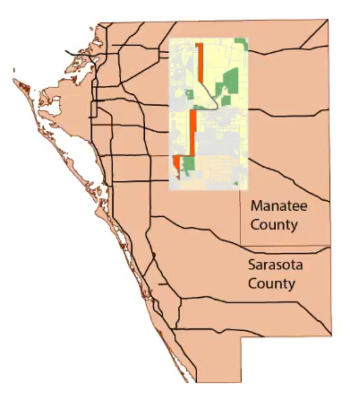
University of West Florida (UWF) main campus location is the primary focus of this map, hence the need to depict the location on the map as prominent as possible. 

Addition features such as the Interstates 10 (I-10), Interstate 110 (I-110), the cities of Pensacola and Ferry Pass are notable reference landmarks that will help the end user of the map locate the UWF main campus location.

This map is designed with the end user in mind such that, at a first glance at the map, major features on the map point the user to the primary purpose of the map. The UWF Logo on the top right-hand corner, the header, the legend, and the bright green star - all these features show the purpose of the map.


Map of the University of West Florida Main Campus, Pensacola

An inserted map of the State of Florida with a highlight Escambia county inform the user(s) that UWF is located in the Florida Panhandle.

Making of the Map:
 -Layout: I chose the Landscape layout instead of the Portrait because it afford me the room to have a cleaner layout of the map features(Legend, Header, North Arrow, etc.)  
 -Scale: I chose a scale with even and whole number because it will be easier for most/all user's conversion uses.
 -North Arrow: I chose the trimmed, minimalist version of the north arrow because I want to minimize distraction from the primary map.
 -Color: I chose a bright yellow color for UWF location, because it contrast well against the light green surrounding, and the same reasons applies my my choice of color for the Escambia County map in the insert.
 -Credit: This is located at the very bottom right-hand corner of my map, and it gives credence to my source. Right about the data source is the 'produced by,' which shows that I created this map using the resources provided.

What I learn/enjoy in this Lab:
-I created my first Shapefile.
-I learn how to locate Metadata.
-I learn how to insert a Lagger Map.
-I edited Symbology and use Query Builder.
-I learn alternative ways to edit maps, such as, Right-clicking instead of Double-clicking.
-I learn how to Clip Data Frame, Exclude Layers.
-I learn how to add multiple shapefiles to Data Frame(s) -by using Shift or Ctrl + select on the keyboard.
-I learn to Safe my work in ArcMap frequently, and Effective File Management.
-I also learn how to create Layers from Selected Features and I had a lots of fun working on the Legend Wizard.

I enjoy this Lab and I'm gaining more confidence in GIS, I can't wait to explore all the possibilities.


Wednesday, January 13, 2016

Introduction

Introduction

Hello! My name is Jim Orunmbe, I am an IT major and currently reside in Pensacola Florida. I am also currently in the Army Reserve and a full-time student. I invest my free time with my girlfriend-Tolu, reading, and volunteering. I also enjoy outdoor fun stuff such as soccer, running and mountain biking. I'm in this class in order to earn GIS Certificate and I do not have any prior  GIS experience. As of now, my goal is to use the knowledge gained from this course to enhance my job in the military, maybe something greater in the civilian world later down the road.

Introduction / Overview


Introduction / Overview

Hello! My name is Jim Orunmbe, I am an IT major and currently reside in Pensacola Florida. I am also currently in the Army Reserve and a full-time student. I invest my free time with my girlfriend-Tolu, reading, and volunteering. I also enjoy outdoor fun stuff such as soccer, running and mountain biking. I'm in this class in order to earn GIS Certificate and I do not have any prior  GIS experience. As of now, my goal is to use the knowledge gained from this course to enhance my job in the military, maybe something greater in the civilian world later down the road.

Here's my Story Map Link: http://arcg.is/1mSnBSI

Map Evaluation Synopses of a Well-designed and a Poorly-designed map.

   Sample of a Well-designed Map: The City of Bellevue.


I consider the above map to be a well-designed map.
Map principles in support:
1.     Graphical excellence. This map is well-designed because it has interesting data on the map that are also represented on the Legend in the bottom-left-hand-corner.
2.     Maximize the data-ink ratio. This map maximized the data-to-ink ratio.
3.     Clear, detailed, and thorough labeling is used. I really like the fact that this map has scale on the legend (this will come handy where distance between 2 or more points are needed.) It also has the cardinal representation of the map orientation.


Sample of a Poorly-designed map: US 1999 Capital Population.


I think the above map is poorly designed.
Map principles in support of my conclusion:
1.     Principle 7. This map violates Tufteism 7, it lacks details and clarity evident in the overlapping circles all over the map. It’s hard to interpret or make sense of.
2.     This map violates Principle 8. The legend is poorly designed, take for instance the following city/town: Carson City on the west coast, Cheyenne, and Pelena have one thing in common -  they all no statistical representation in the Legend. It appears to me that the value falls between “.10” and “.66.” Map users should not be left to speculating the value of what the map represents.
3.     Scale: I think this map failed to meet its objective because the circular representation on the map and the legend did not match ( I measured the radii of the circles.) The scale of cycles on legend did not accurately represent cycles on the map.